Topolska 18, Belgrade | Introducing our first store

Last week I had the great privilege of watching one of my biggest dreams come true. We opened up our first ever permanent retail location! Over the past decade, there have been pop-ups and shows and open studios and meet ups…but never the opportunity to fully let The Letterist live and breathe in a space of her own.

It was without a doubt the most administratively, financially and creatively challenging venture in our history…but in just a few short days since its opening, it has proved to be worth it, and the best possible decision in every possible way.

See, we didn’t exactly open up a store. We opened up the doors to our studio. We created a space where people can drop in, find inspiration, tools or a gift, talk to us about their favorite novel or obsessive journalling habits, and leave feeling just a little more in love with love.

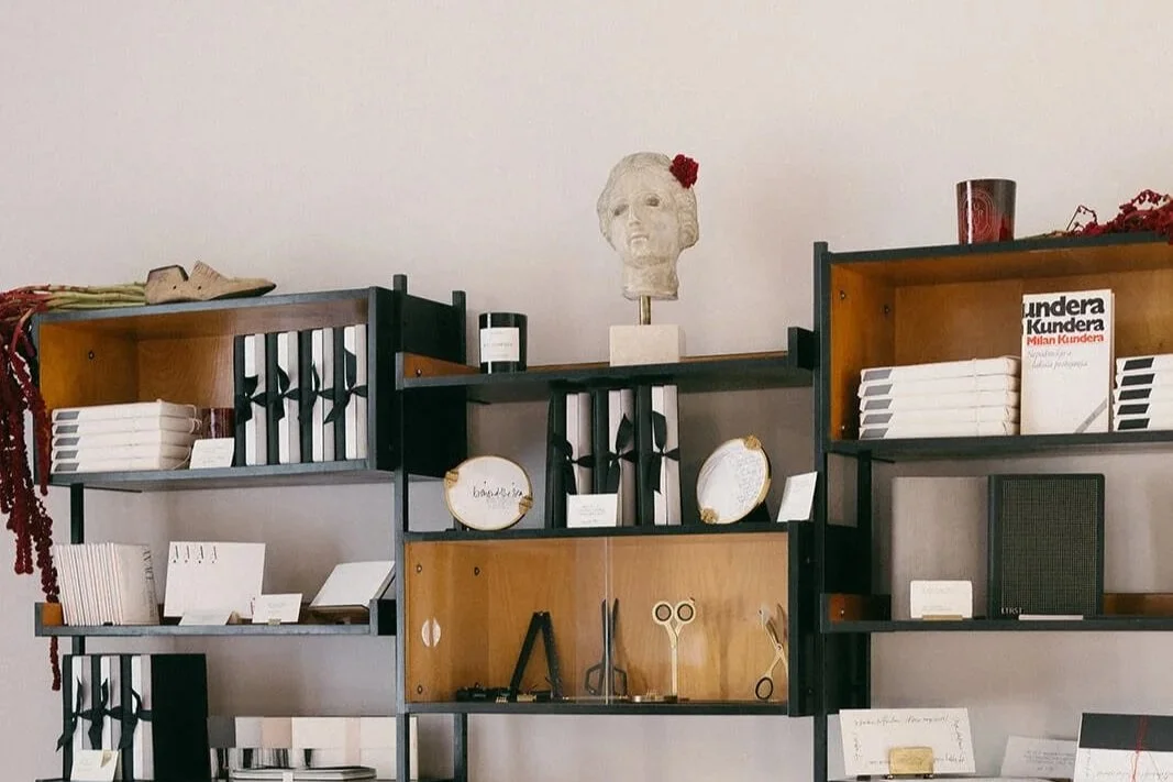
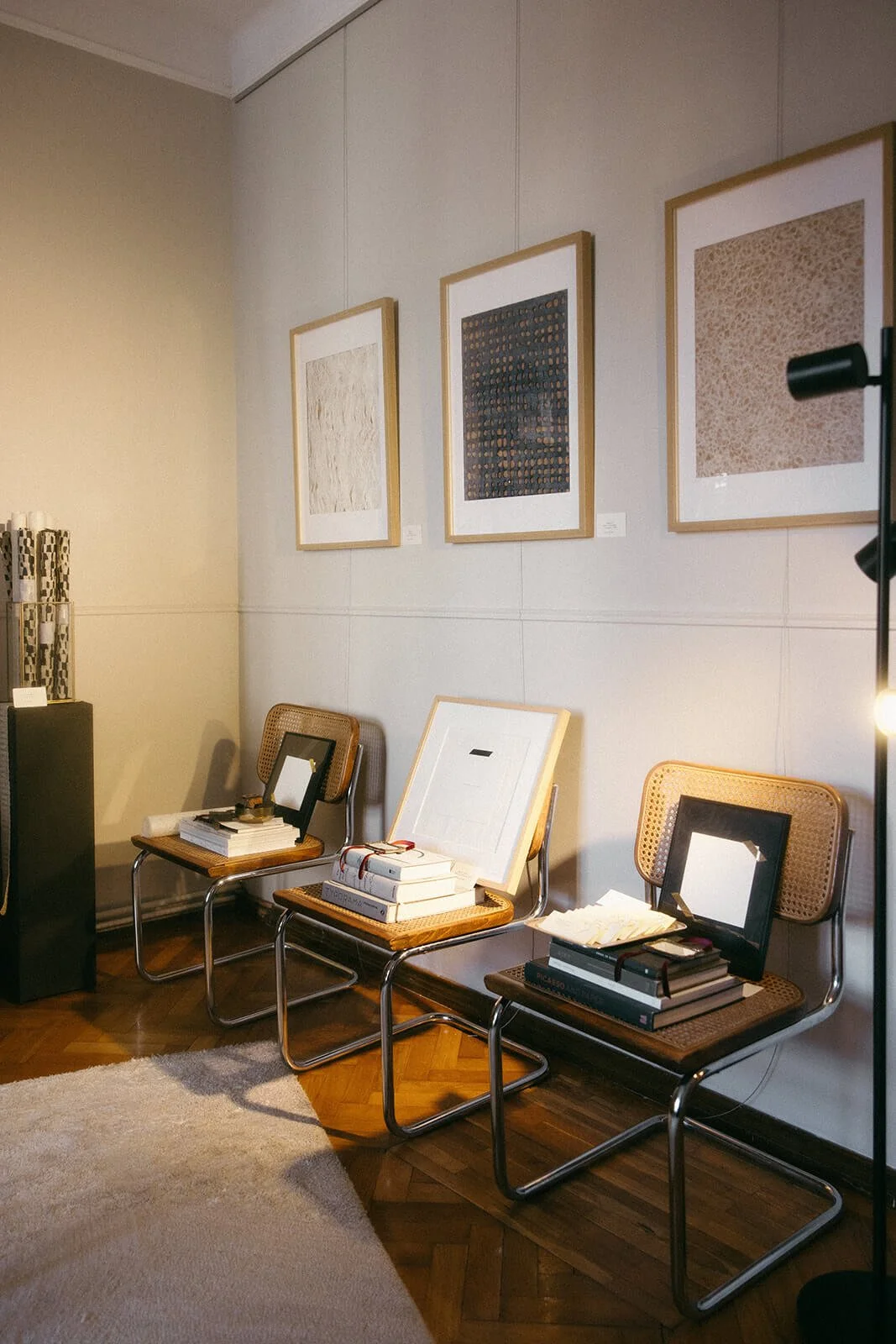
Meet Ophelia: the bust I initially purchased with the aim of reselling in the store…who has now become our high priestess and our muse - the centrepiece I can’t bear to part ways with. She rests above it all, quietly overseeing all the other beautiful stationery, tools, and antiques I’m often a little sad to see go.

I’ve lived in Zambia, New York, London and Paris - I’ve dreamt of having a store in Florence and Milan, Paris, Amsterdam and beyond….and I haven’t let go of any of these destinations, but I felt our first one had to be in my home town of Belgrade, Serbia (and conveniently within walking distance for me and the pups).

This city is nostalgic, romantic, gritty, and old-school cool in a way that no other place is. It can get intensely emotional, it can be stylishly apathetic, it can be rough around the edges and also ooze endless charm.

Our space sits on the first floor of a quintessentially Vračar-Historical villa, on an adorable and unassuming cobblestone street. The address - Topolska 18 - was the set of two popular local TV shows - "Srećni ljudi” - which translates to Happy People, and “Ljubav, Panika, Navika” which translates to “Love, Panic, Habit”…tiny legacies I feel are hardly accidental.

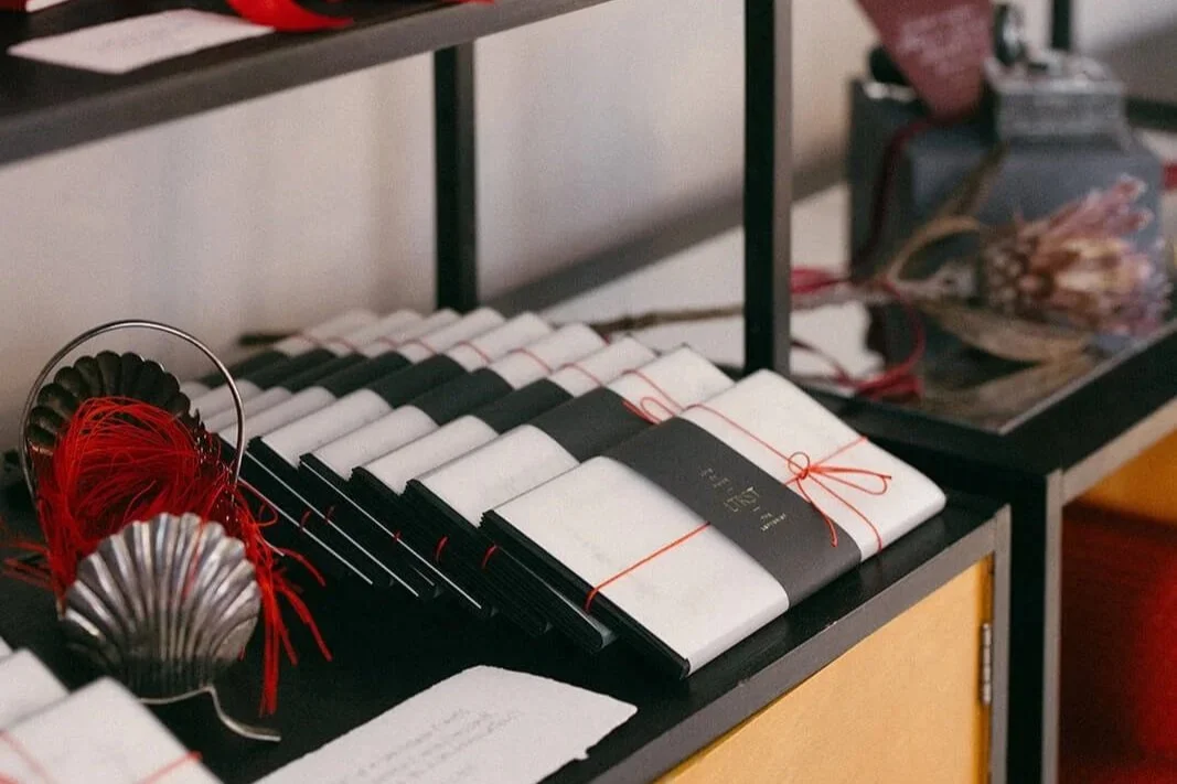
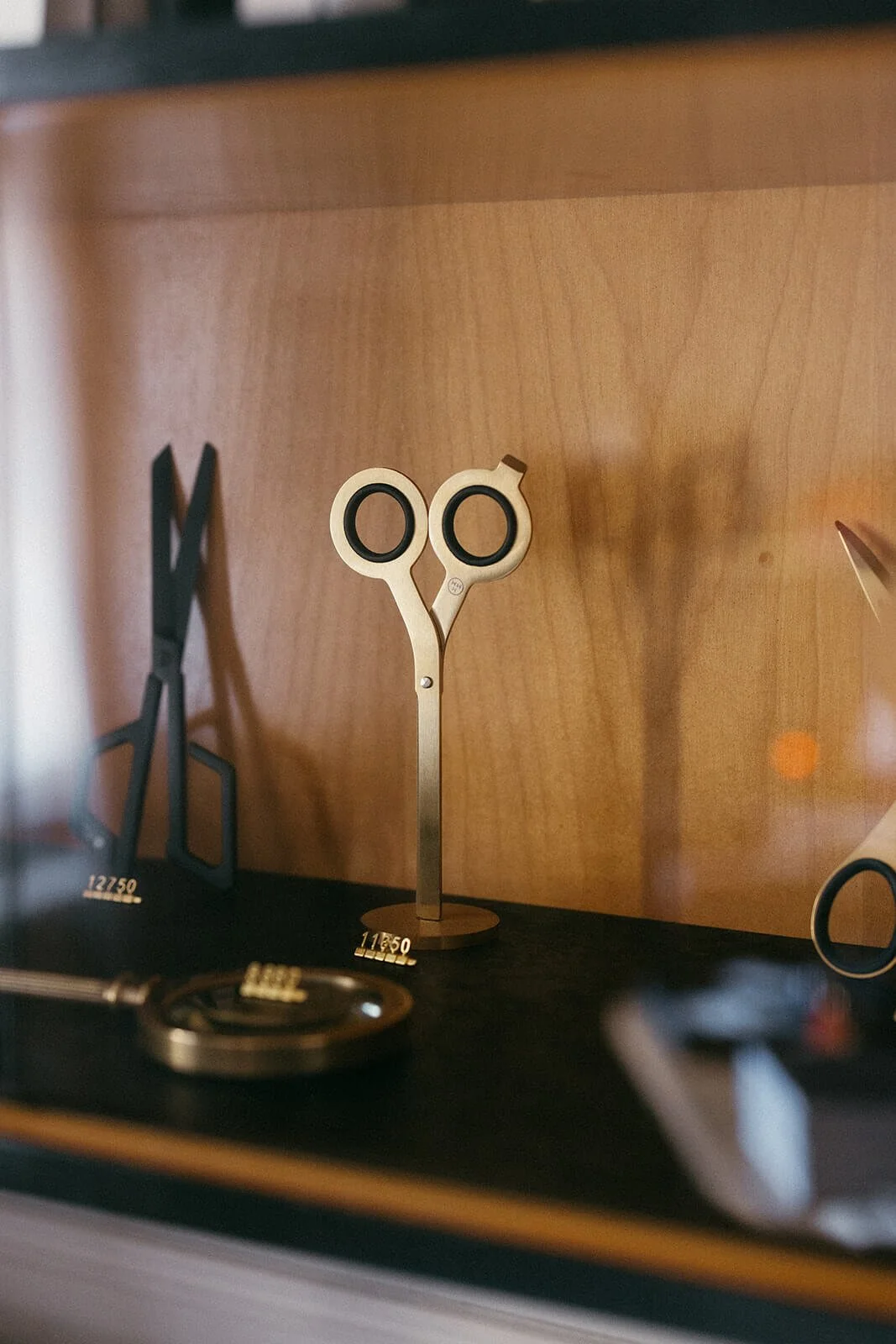
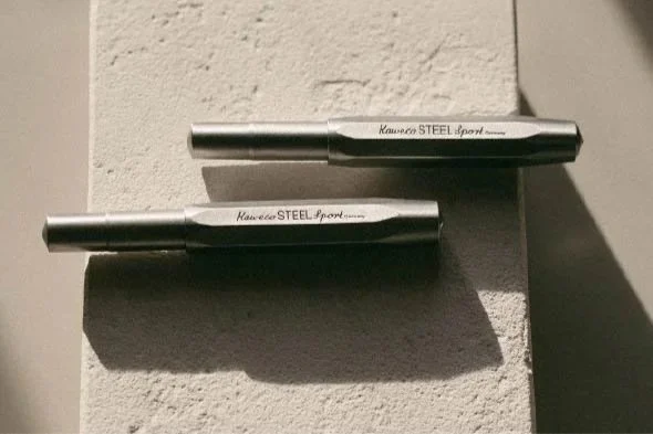
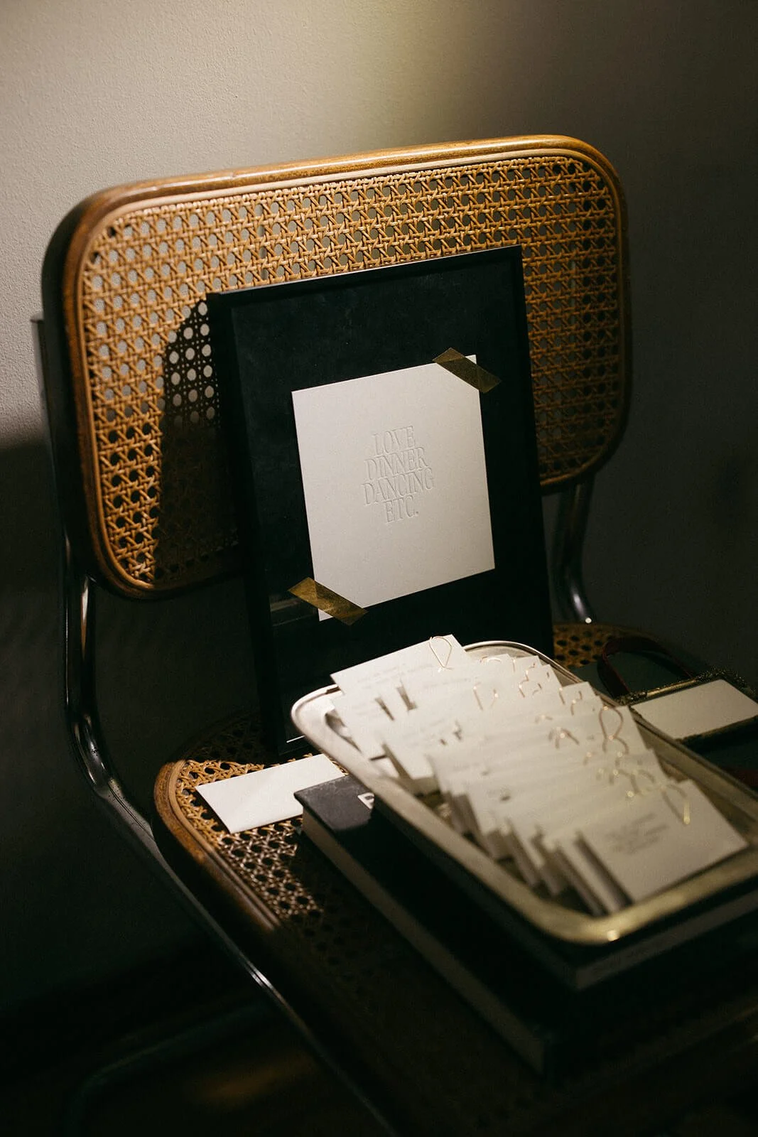
We’ve filled the space with some of our cult-favorite products such as our Dot Grid Notebook and the Desk Calendar, and poured our hearts into creating and/or curating a whole new line of greeting cards, handmade papers, writing tools, antiques and prints from all over the world. The Kaweco writing tools have been an instant hit, with new models and colors coming in and out so quickly I haven’t had the chance to snag one for myself.

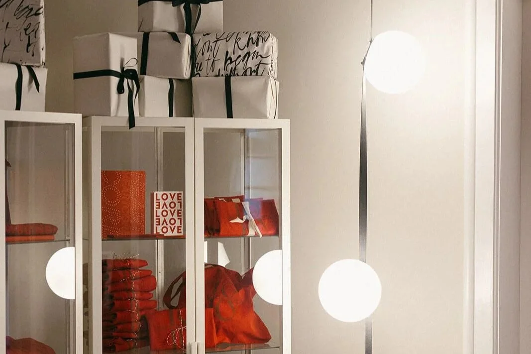
We put an incredible amount of thought into sustainability - recycling parts of old invitation samples into framed prints, or old calendar quotes into tiny wallet-sized notes to self or other. We pulled some fond old favorites out of the archives, we turned offcuts and leftovers into packaging, and we whip out an old typewriter or stamp to manually impress our logo on certain pieces - avoiding the whole rigmarole and carbon footprint of more modernized production.

We had, and continue to have tons of fun with the visual merchandising. A paperclip “bar” served in vintage cocktail glasses, an abstract Christmas tree on a wire frame, an entire bathroom covered in ephemera I’ve collected and carted around the world for years. I can’t wait for you to visit. I can’t wait for you to see it. But most of all, I can’t wait for you to feel it.

Our little red mailbox loves a love letter. If you can’t visit…write to us at:
The Letterist
Topolska 18
11000 Belgrade
SERBIA

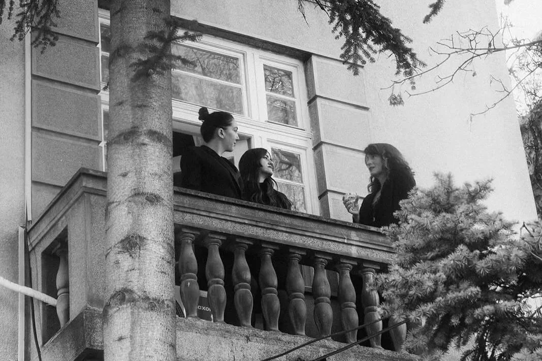
The team on our Juliet balcony, doing what we do best, talking about feelings.

Stop by every Wednesday, Thursday, Friday, and Saturday from 12-6pm and experience Love on Paper in three dimensions. Scents and jazz and puppies and all.
Topolska 18, First floor.

All photos by the insanely talented Monika Frias @latxina

The Design and Art of it All

When we began working on this invitation suite, Alexandra sent us an email that read: “The only thing I will add is that the purpose of this collateral is much less about the information and more about having fun with design and the art of it all.” Music to my ears.

Many of our clients have usually already sent out a Save the Date and/or have a wedding website that contains all the details about the ceremony and weekend. Often times, as is the case here, its a destination wedding so many of their guests have already made travel arrangements and let the couple know they will be attending. So….the invitation becomes more of a formality, or rather…an opportunity to be informal and “have fun with design and the art of it all.”

Letterpress & screenprinted wedding invitation in shades of red

We began by exploring possible layouts for the ceremony invitation, wanting this to be the most stately, elegant and reserved of all three pieces. After looking at various options from a number of our semi-custom collections, we settled on this serif remix of our ceremony invitation design from The Vanguard collection - a modern, fashion-forward, bold and sans-serif piece inspired by film posters.

Fun wedding weekend itinerary for a destination wedding in Italy

We then moved onto working on the secondary piece - an itinerary detailing the events that would fill the weekend. They had sent such creative and poetic wording that I immediately spotted a few words we needed to pull out and make loud. Bike rides, vineyard strolls, games, pizza…in ITALY? Sign me UP.

Europapier had just shared with us a new catalogue of eco-friendly papers from Koehler and I was itching to try out the Rose Quartz. We decided on a large format folded piece meticulously screen-printed in a fiery shade of red and a subtler taupe tone for the smaller print.

Finally, we added a bookmark insert with their website URL to direct guests to the website for more specific details on each of the events. Love the idea of including a favor of sorts in the invitation that guests will be able to put to use and will remind them of the fun party that awaits them in the fall.

Vibrant wedding invitation suite in all the shades of pink and red

We normally assemble our suites with vellum or paper bands, but we didn’t really want to cover up all this typography magic so I spent a Saturday morning haberdashery-hopping in search of the perfect slim red elastic. The outer envelope is made from a Gmund collection called Urban Architect in a shade called Powder…which is ever so slightly pinkish.

This is one of my favorite pieces to come across in our sample drawers…it’s loud, it’s fun, and it screams LET’S LOVE and LET’S PARTY. See more of The Vanguard Collection here or see another fun red suite for Rat & Boa founder Stephanie Bennett’s wedding that was featured in VOGUE.

Letters from Calabria

Letters from Calabria

Sottovalutata…sottovalutata…that’s the word you most often hear in Calabria, arguably — and I now believe, truly — one of Italy’s most underrated destinations. It has nothing of the artful nobility of Florence, the jet set glitz and influencer appeal of Capri, or the minimal masserias of Puglia. But I don’t know…I did take over 2,000 pictures which none of these other destinations have yet inspired me to do. I loved and edited about 200 of them. And then I set myself the difficult task of selecting only 12 to put here.

Read More

Destination Wedding Invitations

Destination Wedding Invitations

Destination weddings have become increasingly popular over the last decade, and creating destination wedding invitations usually requires an elaborate design process that often involves the close collaboration of the couple & their planning team, the stationery designer, the venue, and other vendors. Because the idea of traveling to Provence, Tuscany, or Cabo to celebrate your love with your friends and family is a fun idea - we have created this list of tips to help guide you through some of the nitty gritty details to consider, to hopefully keep the planning (and printing!) process fun too.

Read More

Square Wedding Invitations

Square Wedding Invitations

If you’re wanting to do something different with your wedding stationery, opting for a square wedding invitation can be a strikingly simple way to stand out. When it comes to design, and more specifically to rethinking traditional design, sometimes the solution is as easy as switching up the format.

In a quick Google or Pinterest search, you’ll notice that most wedding invitations are usually about 5x7 or 6x9 inches and more often than not, in portrait orientation. Occasionally they’re flipped to landscape, perhaps to accommodate a long venue illustration, or simply to match the opening of the envelope so that everything follows the same orientation and does not need to be rotated upon opening. (A consideration perhaps, for only the very obsessive amongst us).

The next most popular shape, especially in recent years - is the arched invitation, and then of course there are the uniquely die-cut formats in organic or geometric forms. It’s rather surprising just how rare the square actually is! So of course we’re all about it, and it is the chosen format for the wedding invitation in our beloved stationery collection, The Editor.

Read More

Minimal Wedding Invitations

Minimal Wedding Invitations

Minimal wedding invitations have become a popular trend over the last decade or two, predominantly for couples seeking a more modern take on their wedding styling and stationery. They are largely characterized by concise and simple wording often typeset in small font sizes, large expanses of white (or negative) space, little to no decorative elements, patterns, or illustrations, and monochromatic, neutral, pale, or muted color palettes. Yum. What’s not to love. 

Read More

Folded Wedding Invitations

Folded Wedding Invitations

When it comes to choosing wedding stationery and particularly wedding invitations, the choice can be overwhelming. A design that speaks to you and matches your personalities and event styling is key, but it’s not only what’s written on the invitation that matters; the way the invitation itself is presented can tell a beautiful story. Folded wedding invitations, such as the ones in our beloved collection The Novelist, offer something striking, unique, and unexpected.


Why choose folded invitations?

There are a number of reasons to choose folded wedding invitations…

Read More

CLUTCH; Tiny bags for a big day.

CLUTCH; Tiny bags for a big day.

I mean, if your tiny bag doesn’t show up wearing a veil…what are we even doing here. A fun roundup of seven tiny bags fit for a big day, as envisioned through the aesthetic of each of our wedding collections - The Poet, The Editor, Curator, The Dreamer, The Vanguard, The Novelist, and The Hedonist.

This was a fun creative exercise in style: an attempt to translate the world of each collection ordinarily all captured through print and paper, into a tiny purse that might be seen bobbing down an aisle or runway. I thought about texture and craft and composition of course…but I was also thinking about the personalities of each of these characters more broadly, looking for designers and pieces that in their essence might share similar sensibilities…or spending habits! I was not, at all, thinking about price…which made this virtual shopping spree an extra delight.

Read More

Embossed Wedding Invitations

Embossed Wedding Invitations

First of all, what defines an embossed wedding invitation? People often confuse the words embossing and debossing or use embossed mistakenly to refer to any type of letterpress printing, when in fact these are very different techniques. Embossing requires two print plates or dies - often referred to as the male and female, and the paper is placed between them to create a raised, relief effect when pressure is applied. The embossed text or graphic elements are pushed upwards through the paper, creating a tactile relief and dramatic shadows; perfect for creating striking and memorable wedding stationery.

Embossing can be done with inks, foils, or without color altogether, in which case it is called blind embossing. And blind embossing is our love language. Because of the two print plates which slot into each other, blind embossing allows for a deep impression even without the application of any ink or foil colors.

Embossing is most notably used in Braille - the tactile written language form invented for the visually impaired - which allows readers familiar with the Braille alphabet to interpret words and letters through touch.

Read More